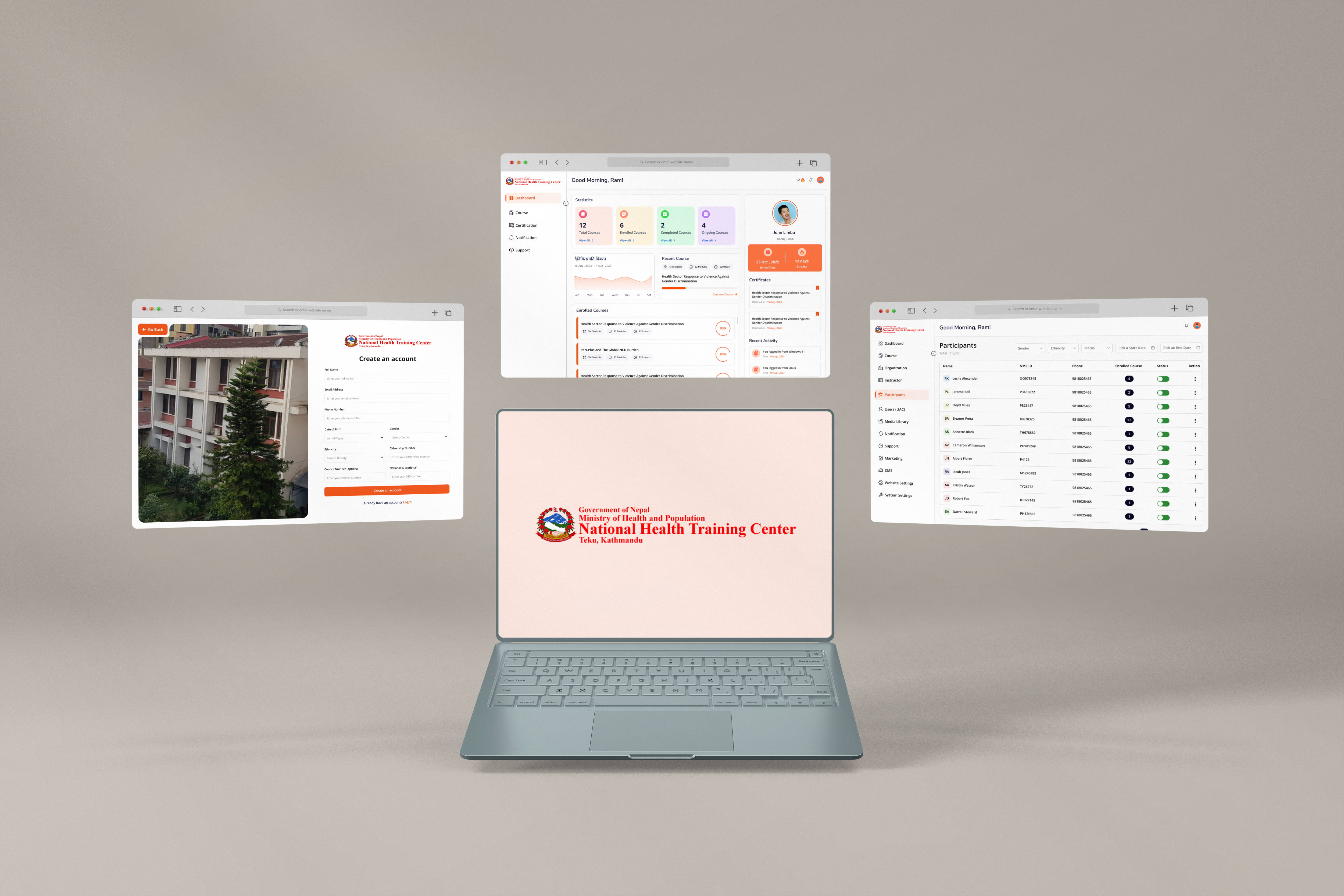
Overview
Training Beyond the Classroom
The project for Nepal Health Training Center (NHTC), under the
Ministry of Health and Population, was about completely rethinking how healthcare training
worked in Nepal. Training that once depended on physical classrooms, printed manuals, and
handwritten exams needed to become fully digital and accessible nationwide. Our team was
tasked with building the LMS from the ground up, creating a system that allowed healthcare
workers, even in remote districts, to learn, take exams, and access resources online. As a
young team taking on a major government project, every step required earning trust through
thoughtful decisions, consistent delivery, and a strong sense of responsibility.
Delivered a nationwide digital learning platform for Nepal Health Training Center (NHTC),
helping healthcare workers access training, assessments, and certifications online from anywhere
in the country. The platform transformed a traditionally paper-based system into a scalable
digital experience designed for accessibility, engagement, and long-term adoption.
50k+
Healthcare Workers Reached
Nationwide
Digital Training Accessibility
100%
Online Certification & Tracking
The Problem
An entire training system running on paper
Healthcare workers across Nepal were studying from physical books and sitting
handwritten exams to complete their professional training. The system worked but only within its
limits. Those limits were significant.
Training required physical presence. A worker in a remote area had to travel to
attend. Exams were paper-based, manually administered, and manually graded which was slow,
resource-intensive, and impossible to standardize at scale. For NHTC as an institution, there was no
visibility into their own training reach beyond what physical registers could tell them.
The problem wasn't that the training content was poor. The problem was that the
entire delivery infrastructure had no room to grow and no resilience when geography, distance, or
circumstance got in the way.
Process
How we took it from a government brief to a live platform
-
1
Stakeholder Discovery | Entering a Government Room as a Young Team
The project kicked off with formal requirements gathering meetings
with the clients. I attended alongside the Project Manager and Technical Lead and
walking into a government institution as a 23 year old designer meant the pressure to
come prepared was real. We couldn't afford to seem uncertain. We approached those early
meetings with structure: prepared agendas, targeted questions about existing workflows,
and a clear framework for capturing what we heard. The goal was to leave every session
with documented, unambiguous inputs, nothing left to interpretation or memory. What we
learned shaped everything: the primary users were healthcare workers with varying levels
of digital familiarity, the admin team would be non-technical government staff, and the
institution needed a system that felt trustworthy and official not experimental.
-
2
Planning & Information Architecture
With requirements consolidated, we moved into planning. I built out a mind map to
untangle the full scope, mapping relationships between the learner-facing modules and
the administrative layer. The course types alone told us a lot about the complexity we
were dealing with: video lessons, text-based content, PDFs, multiple exercise formats,
quizzes, additional resource fields, and an interactive game mechanic. Getting the
information architecture right before touching UI meant every content type had a logical
home in the system before we designed a single screen. User flows and personas followed,
grounding design decisions in real usage patterns rather than assumptions.
-
3
Wireframes
Wireframes were deliberately low-fidelity and focused entirely on system logic and
interaction patterns. For an LMS serving non-technical users with this many content
types, getting the structure right mattered far more than getting it polished quickly.
The wireframe phase surfaced ambiguities early, validated navigation patterns with
stakeholders, and allowed structural decisions to be made before the cost of changing
them increased.
-
4
UI Design
My junior designer and I worked through the UI phase together. Given the user profile
healthcare workers across a range of ages and digital comfort levels simplicity wasn't
just a style preference, it was the central design constraint. Every screen was
evaluated against the same question: could someone who rarely uses digital platforms
navigate this without friction? The sheer variety of content types from passive video
watching to active game participation required each format to feel natural within the
same design system. Multiple revision rounds followed, each driven by structured client
feedback sessions with written records of every decision made.
-
5
Coordination Across the Full Team
Throughout the design-to-development handoff and parallel build phase, I coordinated
across the full cross-functional team. Clear ownership, documented handoffs, and regular
syncs kept both tracks moving without unnecessary back-and-forth. Being a young team on
a government project meant there was no room for informality everything had to be
explicit.
PLATFORM — LMS
What we built for learners
One of the core goals was making sure the platform didn't feel like a chore to
use. The people taking these courses are healthcare workers. They're busy, many aren't particularly
comfortable with technology, and the subject matter is serious. So we put a lot of thought into
making the learning experience feel varied and engaging rather than monotonous. The platform
supports multiple content formats: video, audio, text, PDF, interactive exercises, quizzes,
additional resources, and the Powerwalk game. Each format serves a different kind of learner and a
different kind of content and having all of them available meant no single module had to do
everything.
Video & Text Courses
Video and text courses form the core of most modules. For text courses specifically, we
embedded an audio transcript on every single one so instead of having to sit and read
through a wall of text, a learner could just listen to it. It was a small addition but a
meaningful one, especially for users who might struggle with long-form reading or simply
prefer to learn by listening.
PDF with Book-Style Flip Effect
PDFs were rendered with a page-flip animation that mimics turning pages in a physical book.
Given that these users had spent years studying from printed training manuals, this wasn't
just a visual detail it made the transition from physical to digital feel less jarring.
Something familiar in an otherwise new environment goes a long way.
Interactive Exercises
The physical training books already included exercises — fill in the blanks, multiple choice,
match the following, true or false, and categorization. When we digitalized the curriculum,
we carried these over and made them interactive. What was once static questions on a printed
page became something learners could actually engage with, which naturally helped break up
the reading and kept the experience from feeling one-dimensional.
Quizzes & Additional Resources
Formal quizzes are tied to course progression and feed into the certification layer.
Alongside that, each course has an additional resources section where instructors can attach
supplementary reading, references, or tools without it cluttering the main course flow.
Certificates & Completion Tracking
On passing the post-test, the platform automatically generates a certificate the learner can
view and download. For NHTC, it also meant real-time visibility into who had completed what
-something that simply didn't exist before this platform.
FEATURE SPOTLIGHT
Powerwalk - The Game That Made Bias Visible
Powerwalk was the most distinctive feature on the platform and the one that
required the most deliberate design thinking to get right.
The premise is deceptively simple: a learner clicks start, gets assigned a
random character, and answers questions related to their course. With each answer, their character
moves forward or stays where they are on a shared track. But there's a layer underneath that the
learner doesn't see until the end.
The user's character moves based on their own answers. The hidden characters are
different, they don't respond to what the user does at all. They move or stay based on what society
collectively accepts as the norm for someone in their position. So if the question is whether women
should be doctors, a hidden character who is an uneducated rural woman doesn't move not because the
user answered wrong, but because the social reality surrounding that character's life means that
opportunity doesn't reach her, regardless of what any individual believes.
The reveal
At the end of the game, all the hidden characters are revealed alongside where
they ended up. The gap on the track isn't something the user caused directly and that's exactly the
point. The immobility of those characters is systemic, not personal. Seeing it laid out visually,
after having just played through the same questions, makes that reality land in a way that a
paragraph of text rarely does.
Why this mattered in context
Nepal's healthcare sector is working against a real backdrop of gender
disparity, particularly in rural areas where access to education and professional opportunity is
unevenly distributed. Powerwalk wasn't designed to lecture learners it was designed to show them.
The reveal at the end does more than a paragraph of text ever could, because the learner
participated in producing the outcome they're now looking at.
The design challenge
Designing Powerwalk was tricky because the game had to feel fun enough to engage
with but serious enough to carry the message. We had to make sure the characters felt real and
relatable without being stereotypes. And the reveal at the end needed to hit — not in a way that
made the learner feel guilty or shocked, but in a way that just made them think. Every small
decision in the game had that weight behind it.
PARTICIPANT EXPERIENCE
The learner journey | From registration to certification
The participant-facing side of the platform was designed around a single
principle: every step in the journey should feel earned, not bureaucratic. From the moment a
healthcare worker creates an account to the moment they download their certificate, the flow had to
be clear, motivating, and free of unnecessary friction.
Onboarding | Account Creation & Profile Completion
Users create an account and log in to the portal. Before they can enroll in any course, they're
required to complete their profile information. This was a deliberate gate not a blocker. NHTC
needed accurate participant data for tracking and verification purposes, and building profile
completion into the enrollment prerequisite ensured the data was captured at the right moment,
when the user had clear motivation to proceed.
The Dashboard
After logging in, participants land on a personal dashboard that gives them a live view of where
they stand. At a glance they can see their total courses, enrolled courses, completed and
ongoing courses, their joined date, certificates obtained, and their streak count. The streak
increases each day a user logs in consecutively. It was a lightweight engagement mechanism
designed to build a daily learning habit without requiring any additional effort from the user.
For a platform asking healthcare workers to add something new to their routine, that kind of
passive motivation matters.
Courses | Browsing & Enrollment
The courses section displays all available training programs. Users can browse and enroll
directly from this view. The platform's initial focus is on Gender-Based Violence (GBV) training
a subject area that carries real weight in Nepal's health sector context and informed many of
the content and interaction decisions throughout the design process.
The GBV Course Flow
Once enrolled, the learner moves through a structured sequence:
- Intro video - sets context for the course before any learning content
begins.
- Pre-test - assesses the learner's existing knowledge. Scored for awareness,
but results do not affect pass or fail. This removes the anxiety of being judged on what you
don't yet know, while giving NHTC meaningful baseline data.
- Course content - delivered across video lessons, text courses, and PDF
materials with the book-style flip effect, with no single format taking precedence, each
serves a different learning need. Interactive exercises are embedded throughout: Fill in the
Blanks, MCQ, Match the Following, True or False, and Categorization.
- Powerwalk - the game mechanic described separately, integrated as part of
the course experience rather than an afterthought.
- Post-test - a formal assessment the learner must pass to receive
certification. Unlike the pre-test, this one counts.
The pre-test and post-test structure was a considered design decision.
Separating baseline knowledge from evaluated performance meant learners could engage with the
course material without defensiveness and meant the post-test result carried genuine meaning
rather than being muddied by where someone started.
Certification, Notifications & Support
On passing the post-test, the platform automatically generates a certificate. Learners can view
and download their certificates directly from their dashboard. A dedicated notifications section
keeps learners informed of relevant activity like course updates, reminders, and system
messages. For support, participants can raise tickets directly from the platform. Each ticket
opens a focused channel for the issue, keeping support interactions organized and traceable for
both the learner and the admin team managing responses.
PLATFORM — CMS
Built for the people who'd actually use it every day
The CMS was the administrative backbone of the entire platform and arguably the
surface that required the most careful design thinking. Its users weren't developers or designers.
They were government staff managing a national health training program, many of whom had never
worked with a digital content system before. Getting this wrong would mean the platform couldn't
sustain itself after handoff. Getting it right meant NHTC could own and operate the system
independently, without ongoing technical support for routine tasks.
Admin Dashboard
The first thing an admin sees after logging in is a modular overview - total participants,
total enrollments, total courses, and active users surfaced at a glance. Below that, a new
users graph tracks growth over time, a gender pie chart gives demographic visibility into
the learner base, and a recent activity feed shows what actions have been taken. The goal
was to give administrators meaningful situational awareness within seconds of logging in,
without requiring them to dig through menus to understand the state of the platform.
Course Management | A Five-Level Content Hierarchy
Course creation was structured around a deliberate hierarchy: Course → Course Media → Module
→ Chapter → Subchapter. This architecture reflected how NHTC's training programs were
actually organized — not how a generic LMS might assume they should be. Admins could create
new courses or edit existing ones, with a WYSIWYG editor for text-based content, upload
support for video and PDF materials, and the ability to build out all five exercise types
and quizzes from within the same interface.
Participant Management
The participants section gave admins a full view of every learner on the platform - name,
position, email, course completion status, and verification status. Admins could add new
participants manually and verify participant status directly from the same view. For an
institution that previously had no digital record of who had trained and who hadn't, this
was a fundamental shift in how NHTC could manage its workforce development.
Support Ticket System & Certification Management
Participants could raise support tickets from the learner side of the platform. Admins
received and managed these from a dedicated support section - able to view, reply to, close,
or delete tickets. The interaction model was deliberately familiar, modeled on how support
channels like Discord tickets work. Admins could also view all certificates issued across
the platform, giving NHTC an auditable record of credentials issued.
Admin & Page Content Management
A parallel section for managing the admin team itself - same structure as participant
management. Admins could also edit the content of the platform's public-facing landing page
directly - hero sections, titles, FAQs, and other static content without touching code. A
deliberate decision to keep the client fully autonomous post-launch.
DESIGN DECISIONS
The choices that mattered most
Bridging the physical-to-digital gap
The users coming onto this platform had spent years studying from physical
books. The PDF flip effect was a small but intentional nod to that keeping something familiar intact
while everything else changed. When you're asking someone to abandon a workflow they've always
known, preserving even one recognizable touchpoint lowers the barrier to adoption meaningfully.
Managing content variety without visual chaos
Five exercise types, three content formats, a quiz system, and a game all living
inside the same platform. The design challenge was giving each format its own appropriate treatment
while keeping the overall experience coherent. A tight design system and consistent component logic
made that possible.
Designing for low digital literacy without designing down
The temptation with non-technical users is to oversimplify to the point of being
patronizing. The real challenge is removing friction without removing capability. Every
simplification was deliberate not a default.
Familiar over innovative & Trust through visual consistency
For a government institution deploying a platform to a workforce with varied
digital experience, familiarity was more valuable than novelty. Interface patterns were chosen
because they worked and because they'd be recognizable, not because they were interesting. For
healthcare workers encountering this platform for the first time, visual consistency was a form of
trust-building. Inconsistency in a government platform reads as unfinished or unreliable. The design
system was held tightly throughout the entire engagement.
Challenges
What made this difficult
Users weren't tech-savvy and that shaped every decision
Designing for healthcare workers who may have limited digital experience isn't just a UX
consideration it's the central design constraint. Everything from navigation labels to button
placement to error messaging was evaluated through that lens. The LMS had to feel approachable
on first contact, not something that required its own learning curve before the actual learning
could begin.
Designing meaningful interactivity, not just functional interactivity
Powerwalk wasn't a standard feature request. Building a game mechanic that carried genuine social
commentary and doing it without being heavy-handed or reductive was a real design challenge. The
interaction had to be intuitive enough that learners could engage with it naturally, while the
underlying logic had to be robust enough to make the reveal meaningful. Getting both right at
once took iteration.
Earning credibility as a young team on a government project
Government projects carry institutional weight. Decisions go through layers of review,
expectations around professionalism are high, and there is limited tolerance for ambiguity. As a
young team, we compensated through preparation, documentation, and consistency showing up to
every meeting ready, and leaving every session with a clear written record. Over time, the work
earned the trust that our age might have initially put in question.
Impact
What the platform delivered
NHTC launched with a fully functional digital training infrastructure the first
of its kind for the institution. Healthcare workers across Nepal gained access to structured online
learning across multiple content formats, interactive exercises, formal assessments, and verifiable
digital certificates all without being dependent on physical attendance or geographic proximity to a
training center.
NHTC administrators moved from no visibility into training completion to a
centralized, real-time dashboard. The admin team (non-technical government staff) could manage,
publish, and update course content independently without relying on technical support for routine
operations. Powerwalk added something harder to quantify but arguably more lasting: a learning
experience that made systemic inequality legible in a way that traditional training content rarely
achieves.
For our team, this project was proof that preparation, discipline, and a willingness to take the
work seriously can close a lot of gaps including the gap between being 23 and being trusted with
a government contract.
Reflections
What this project taught me
-
1
Earning trust on a government project is a process, not a
moment. It accumulates through every prepared meeting, every documented decision, every
delivered commitment. There are no shortcuts and no substitutes.
-
2
Designing for non-technical users is one of the most demanding
UX challenges. The standard for clarity is higher, the margin for confusion is lower,
and the temptation to add just one more feature has to be consistently resisted.
-
3
The most impactful design decisions aren't always visual.
Powerwalk's power came from its logic from what happened beneath the surface.
Understanding how interaction design can carry meaning, not just function, changed how I
think about what design is actually capable of.
-
4
Documentation isn't bureaucracy it's protection. For a long
government engagement, a clear paper trail protects the client, protects the team, and
keeps the project honest when pressure builds.
-
5
Age matters less than preparation. Walking into a government
room at 23 is only uncomfortable if you're underprepared. Come with structure, stay
consistent, and let the work make the argument.
What I'd do differently
Push earlier for user testing with actual healthcare workers rather than relying
solely on stakeholder feedback as a proxy for end-user needs. A phased rollout launching core
content modules first before layering in assessments, certification, and game mechanics would have
reduced delivery risk and created earlier feedback loops with real users. And I'd spend more time
during discovery specifically mapping the range of digital literacy across the intended user base,
rather than treating it as a single, uniform constraint.